DATA STORIES THAT WE DESIRE TO TELL!
Visualization of the Week
e-Transactions in India
The graph represents the growth of e-Transactions in India from 2014 to 2018. The tremendous rise in digital transactions from 2016 to 2017 can be explained because of demonetization and digital inclusion. In 2018, however, several rules and regulations such as mandatory KYC for digital wallets and UPIs led...
Interactive Tools | User-Friendly Data Depictions
Net Payroll Data (EPFO)

The above tool represents the net payroll subscribers in the formal sector for past one year. The visualization clearly shows that the number of EPFO subscribers in northeastern region of the country is relatively low. The motion of the graph also says that the least number of...
Static Graphs - Old School Visualizations
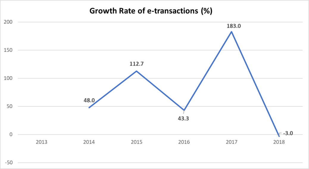
e-Transactions in India
The graph represents the growth of e-Transactions in India from 2014 to 2018. The tremendous rise in digital transactions from 2016 to 2017 can be explained because of demonetization and digital inclusion. In 2018, however, several rules and regulations such as mandatory KYC for digital wallets and UPIs led...